How I Got The Shot: Tarzan & James
Short blog on how Adrienne got the Tarzan & James image.
March 5th, 2019
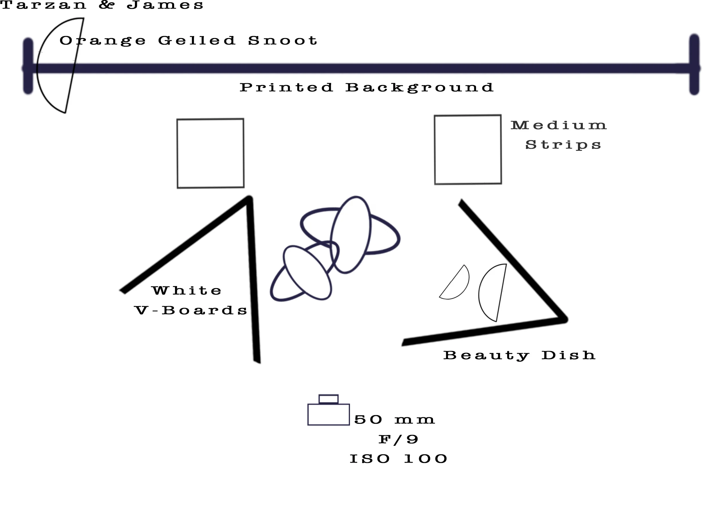
Lighting Schematic for Tarzan & James ©2019 Adrienne Row - Smith / Strast Media
Normally, my favourite images are high contrast with an accent of colour. I like to do larger than life production photographs, however I prefer their technical setups to be minimal. However, I wanted to try my hand at emulating a big production and lighting photograph to just see how far training my eye via the Algonquin Photography Program has gotten me.
The image that I wanted to Emulate was David LaChapelle’s American Jesus: Hold Me, Carry Me Boldly (2009). However, before even going into the studio I had a lot of prep work to do. Firstly, I needed to understand the lighting (as much as I could get through the camera).
Tarzan & James ©2019 Adrienne Row - Smith / Strast Media
Initially, I was under the impression that there was a hair light and kicker in the background that helped give the ‘Jesus’ of the image his glow. However, based on other lighting around the bodies, and after further consultation with others it was decided that the best route would be to use medium strips off to the side and pointing at the subject. Then, I decided to use a beauty dish up high, and a parabolic with a 3 degree grid down below to help create a harder shadow while also still ensuring light filling in on the subjects. Finally, to make sure that the subjects had enough even lighting, I decided to enclose my set with white v – boards. During shooting I realized that the Beauty dish was a little too harsh and hot (meaning that the subjects were having very bright spots landing on them overexposing certain areas) on the subjects – that I decided it would be better to bounce the light back into the white v – board to diffuse it a little bit more. And not to forget, I included an orange gelled snoot shooting through my background, to create the illusion of the sun setting.
Once I had the lighting figured out, I need to go get supplies. I found the greenery that “Tarzan” was sitting on at Michael’s, and then found the leafy flooring (which was actually a wall trellis) at Lowe’s. However, the most challenging part was creating the background. The background was printing on vinyl, after I found a royalty free image online. Once I had all these pieces and lighting together it was time to head to the studio and tie it together.
After shooting with my models (shout out to Lucas & Jesse for being great sports!) I then imported the images into photoshop from Phocus (Hasselblad specific software) and began to put it all together for the final image you see below!
Why Printing is More Important Than You Think
In the digital age, printing is as important as ever. Check out Strast Media’s blog post as to why we think printing is vital in the wake of the digital age.
Printing in the digital age appears to be a topic of great disccusion, with some emphasizing its importance while other feel that printing is becoming a dying industry. However, at Strast Media we beleive that printing is still an important asset. Here at Strast Media, we believe that printing helps to enhance the vision of our clientele while also showcasing our work in its best light. Thus we want to elaborate on the importance of printing and understanding the process it takes to print!
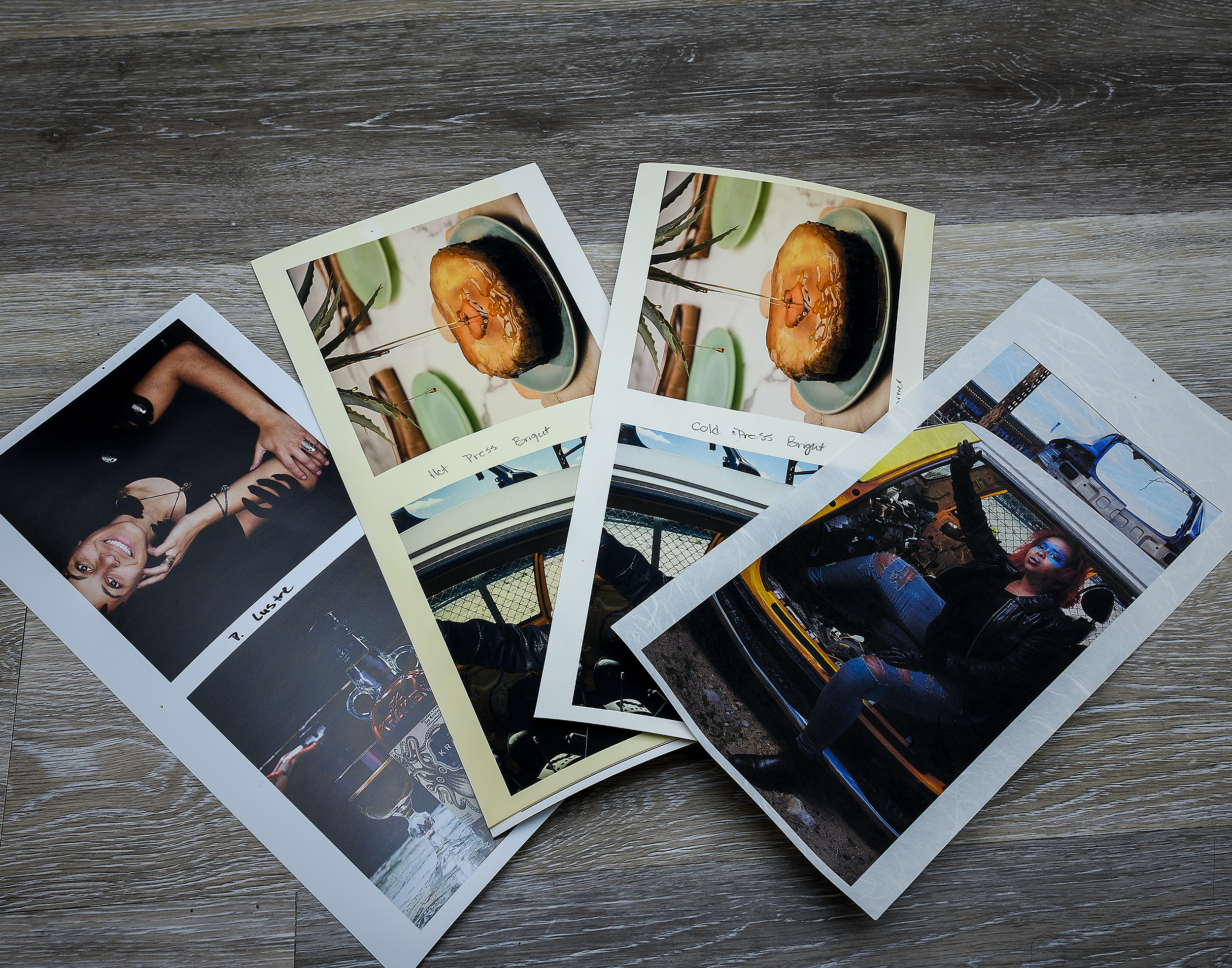
Experimenting with test printing helps you to better understand which of your images look great with texture, less colour or even a colour cast!
The upside to the digital age in regards to printing, is that now, printing is fairly accesible and afforable for photographers and creatives of any level. But if you’re new to printing it can be a daunting endeavour to wrap your head around. Especially with the varying degrees of textures and colour boosting papers that can be accessed, it’s difficult to know where to start.
So let’s start with the basics, you have the perfect image completed edited and ready to print - but how do you know paper is going to best showcase your efforts? Will be something with a bit of texture? Or a paper that has a colour cast to it? The questions and options are endless! That’s why photoshop or any editing software with access to ICC profiles is a great way to experiment and start. For those that don’t know what ICC Pofiles are, they are a set of data that characterizes a colour input or output based industry standards and can be set by the user based on their needs. In short, ICC profiles allow for the user to digitally mimic an output for printing in order to get a closer picture to what the image will look like when it is printed.
With that in mind, a user can use ICC profiles to see what the potential outcome of their print will look like without having to spend money and time on paper and printing! However, at Strast Media we believe that this is a helpful step, it is always better to do test prints to get an accurate picture of what an image will look like.
The upside to this is that multiple stores like Henry’s and Vistek offer paper packages that allows you to experiment to see the physical differences that paper can have on your images . At the end of the day, printing helps to give your clientele a concrete example of what you’re capable of ,and helps to drive home your abilities as a creative! So be sure to try printing out and give your brand a better representation of your vision.


